When the reimbursement works, but the user is left in the dark
I redesigned the health reimbursement tracking experience at Bice Vida so people could understand what was happening with their request, how much they'd receive, and what the next step was.
The Challenge 🧨
The problem wasn't the reimbursement process itself — it was that the user couldn't understand it.
Reimbursement is the main reason people log into the Virtual Branch and the App: it involves their money and their health. SLAs were being met — but as soon as a request was submitted, the user was left without any signals. My goal was to turn an opaque process into one that was understandable and traceable.
User behavior confirmed what they were saying: in the History screen, thousands of people came looking for a request, couldn't find it, and left without resolving anything — almost 18,300 times in a single month. In the Detail screen, instead of trusting what they saw on screen, they preferred to download the settlement PDF to understand how much they'd been paid: almost twice as many people downloaded the PDF as reviewed the detail directly. And when we asked why they rated that screen poorly, 8 out of 10 responses in June said the same thing: they didn't understand the result.
The user wasn't looking for new information. They were looking for certainty — without calling, without checking their bank, without asking for help.
How I Researched It
Triangulation 🔎I didn't want to design based only on what users said — I wanted to understand where the experience was actually breaking down. So I combined generative, evaluative, attitudinal, and behavioral research, so that every decision was backed by more than one source.
Generative
Consolidated research from 2025–2026, interviews, and service mapping (service blueprint) with Operations/Settlement: what the user sees and what happens behind the scenes, in the internal process.
Evaluative
10 moderated usability tests (2025 and 2026): remote sessions for the web and in-person sessions to validate the App prototype.
Attitudinal
Ongoing satisfaction (ISN) and perceived effort (CES) surveys, plus a status-naming survey (n=838).
Behavioral
Product analytics and technical monitoring (Pendo, Datadog) and Contact Center data: downloads, retries, and unresolved returns, time spent on each screen.
✅ What We Confirmed — validated by more than one source
- "Settled" and "approved" are read as paid, when they're not.
- It's hard to understand how the reimbursed amount was calculated.
- A trustworthy payment date removes anxiety — and 7 of 8 users use their bank as that reference, not the platform.
- The data in the History screen doesn't make it easy to recognize a request; it's missing statuses and the time between them.
💡 What We Framed as Hypotheses — to validate in testing
- A status with a result, cause, and next step would reduce anxiety.
- Showing the amount calculation with explicit percentages will build trust.
- A History screen designed as a tracking panel will reduce repeated searching.
- Being able to name or identify each request would help find it faster.
Key Insights
The problem wasn't the flow: it was comprehension.
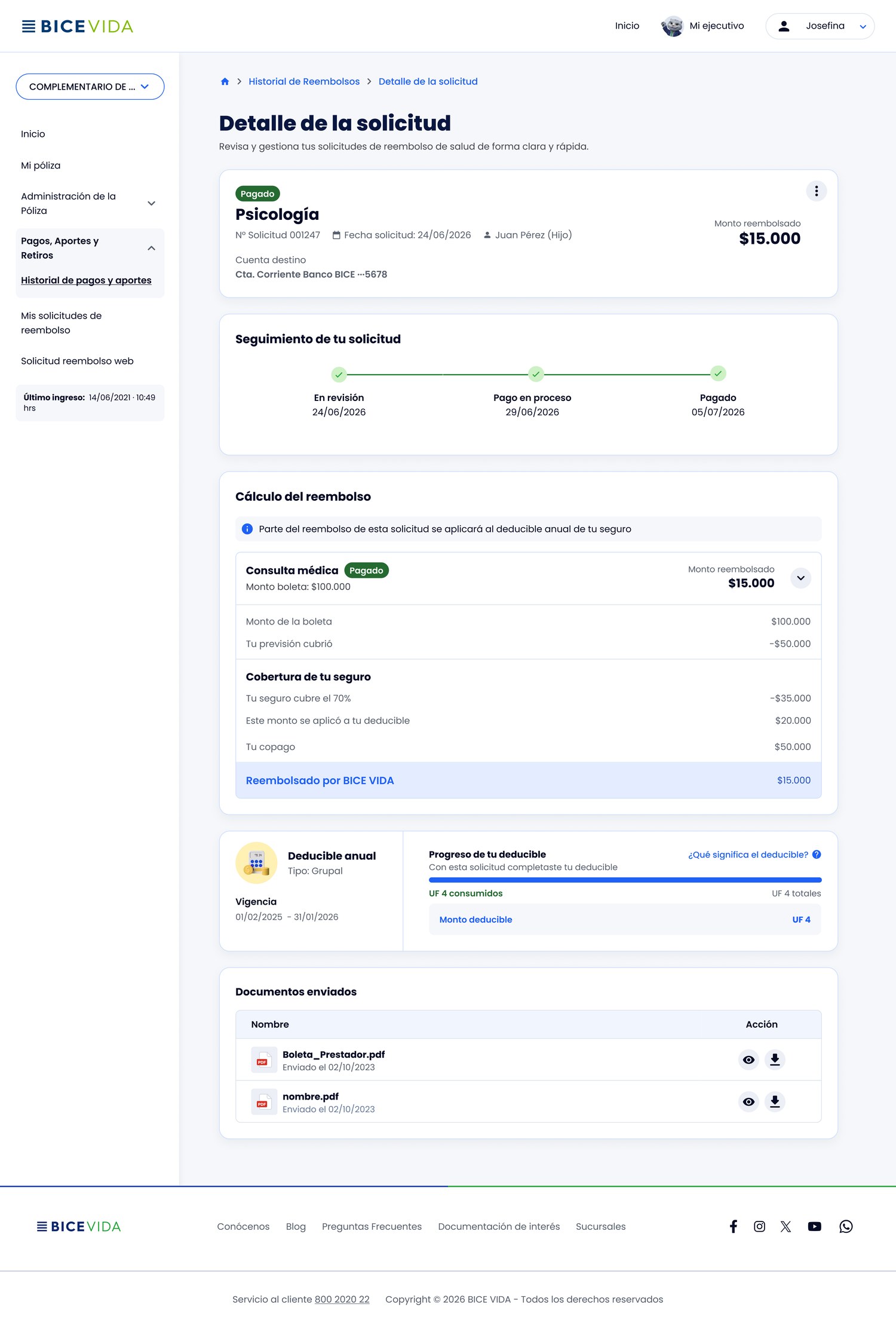
The status doesn't answer the user's question
The statuses ("approved," "settled") described the internal process, not whether the money had already been deposited or what the next step was.
The amount was a black box
Users couldn't reconstruct how the amount they received was calculated, and ended up relying on the settlement PDF.
There was no tracking or payment date
With no traceability or next steps, users came back again and again to check, and only confirmed payment once they saw it in their bank account.
Not all rejections were final
The History screen didn't distinguish a recoverable request from a truly rejected one — findability was pain point number 1.
From Insights to Decisions
First I defined what I didn't know, and only then chose the method to resolve it: I built two user personas (Patricia, the expert; Ernesto, the novice) with their complete journeys, an opportunity map connecting each hypothesis to its evidence, a Kano survey to prioritize what to build first, and a matrix assigning the right validation method to each open question.
Designed Screens 📱
A Detail screen that explains itself: the same language for "under review" and "paid" — the only difference is the information filling in, not a different screen. That same clarity was carried over to the App, where the reimbursement segment was the lowest-rated.
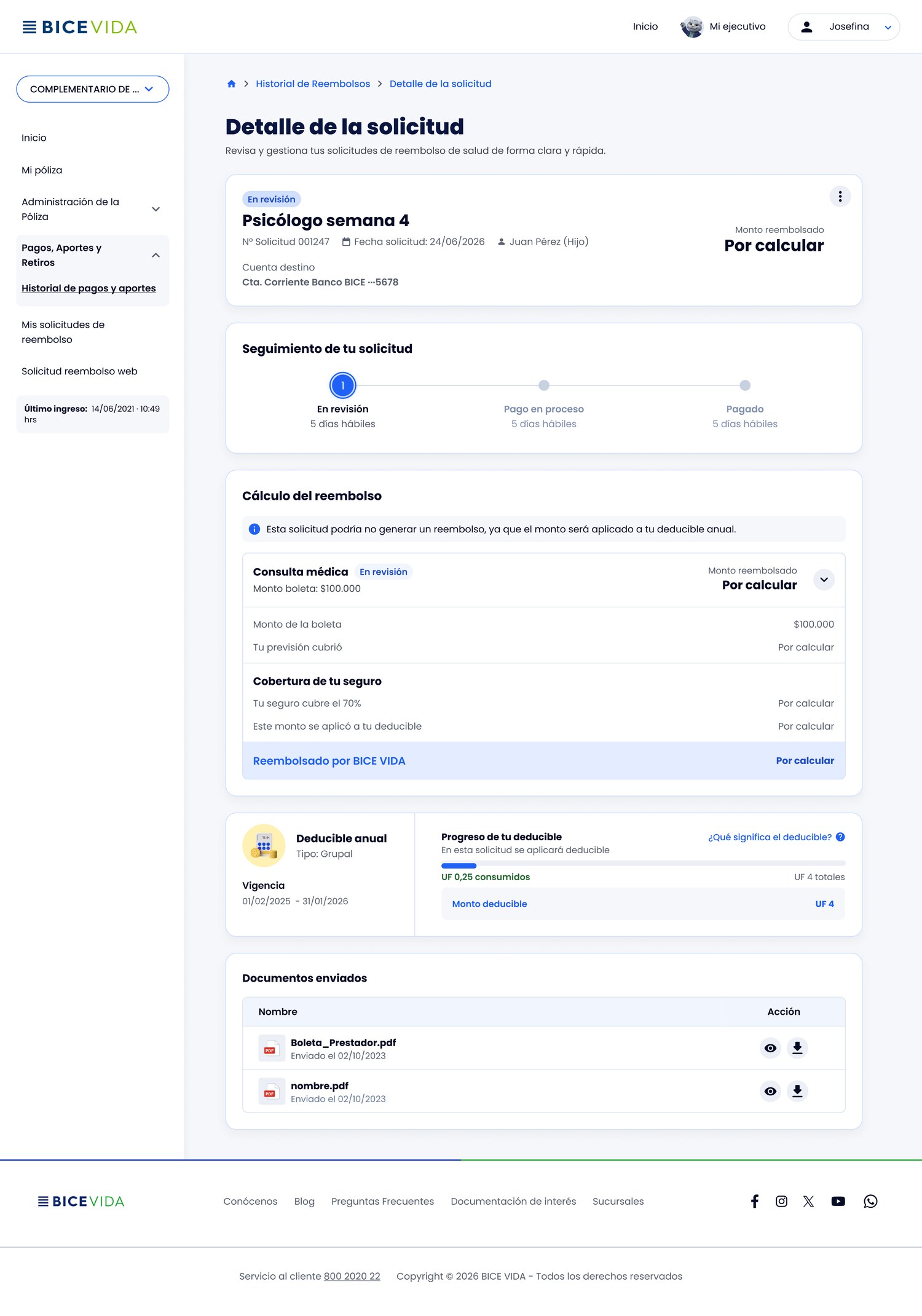
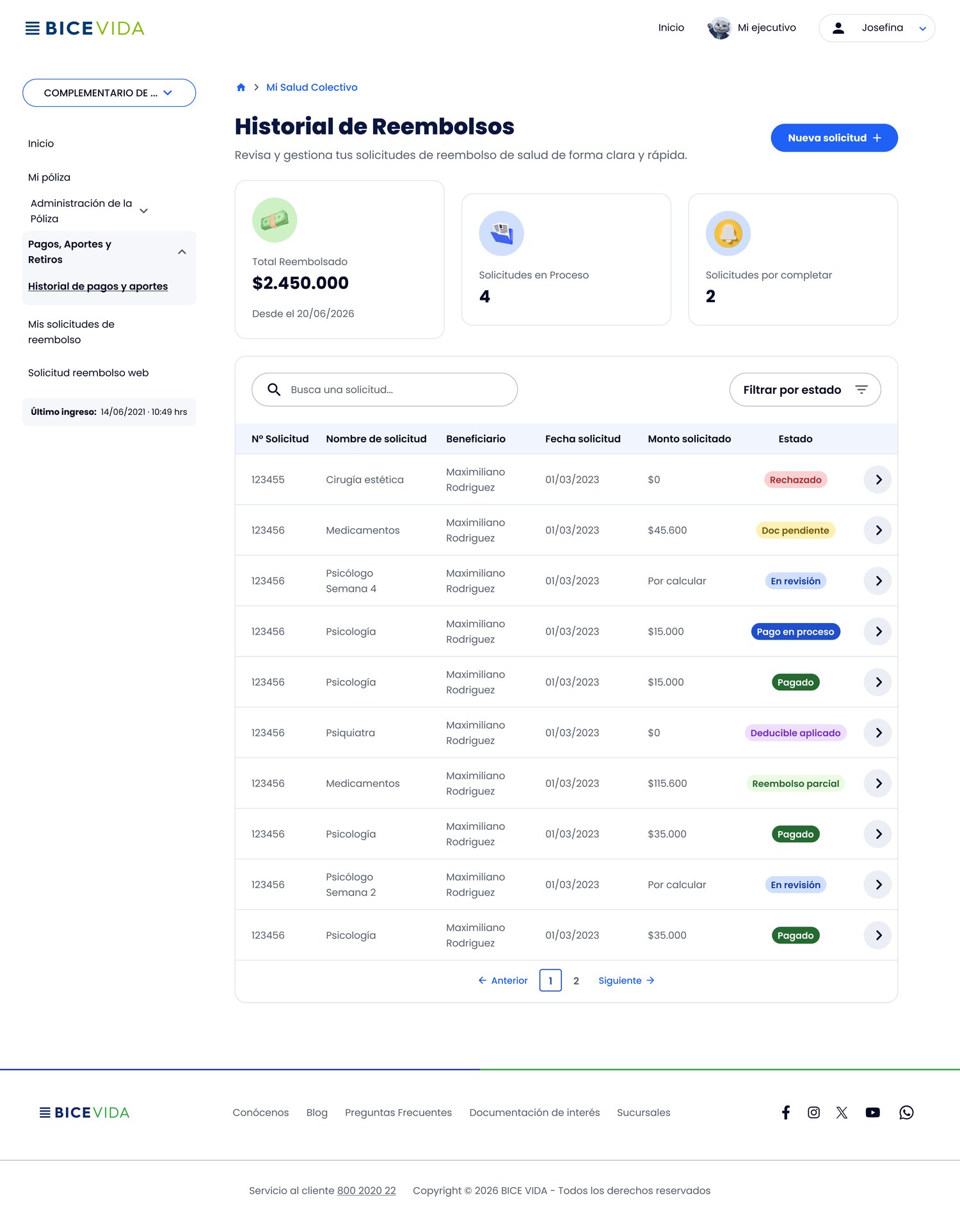
One Solution, Two Contexts
On Web, the History screen has more room for the full detail. On App, I prioritized summary tiles (reimbursed, under review, pending validation) and color-coded statuses to recognize each request without opening it — the same clarity, adapted to each platform's context.


Validation
I split validation into two stages, based on what needed testing on each platform: 6 remote sessions with Virtual Branch (web) users and 4 in-person sessions, needed to closely validate the App prototype — novice and expert profiles, plus clients who had migrated from another insurer. I carefully separated what was a prototype flaw from what was a real comprehension problem, to avoid contaminating the results.
What Worked
- The deductible explanation was the highest-rated element — several 5/5 scores for the practical example.
- "Appealing a rejected request" was the most valued feature across the board.
- The History summary tiles were well received and reinforce the perceived value of the insurance.
- Clients who had migrated from another insurer perceived the experience as smoother than their previous one.
What We Kept Iterating On
- The copay isn't explained: most people don't know what it is (same fix needed as the deductible).
- A request with two statuses (one part paid, another pending) is confusing.
- Edit/correct has low discoverability; users ask for an explicit pencil icon.
- Searching by request number doesn't work for them; they want to search by type and date.
The biggest change wasn't redesigning the reimbursement. It was making visible what had always been happening behind the scenes.
Expected impact: reduce reliance on the settlement PDF, increase understanding of the reimbursement status and amount, and decrease uncertainty about the next step.
Design validated through research and 10 usability sessions (web + App). The flow now moves into implementation — production impact metrics, tied to the 2026 Experience goals, pending measurement after launch.