Redesigning the app
from scratch for
real retirees
From an app with less than 10% adoption to a modern, accessible mobile experience validated with users aged 64–83.
The Challenge 🧨
Visibility
Insufficient contrast and small typography.
Cognitive Load
Too many technical steps for simple tasks.
My Process
User Centered 🌿Discover
Research, interviews, and real data analysis.
Define
Synthesis of findings and opportunity detection.
Design
Architecture, wireframes, and accessible flows.
Validate
Testing with older adults and refinement.
I led the end-to-end experience design: flow definition, Figma design, and testing with real users. Responsible for 9 usability sessions with retirees aged 64–83 and synthesis of findings that guided product decisions.
Figma (design and prototyping), Maze (remote testing), in-person moderated interviews, qualitative and quantitative pattern analysis.
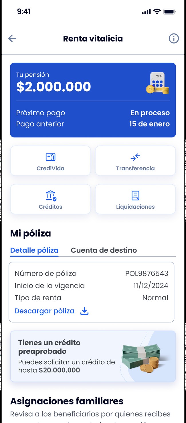
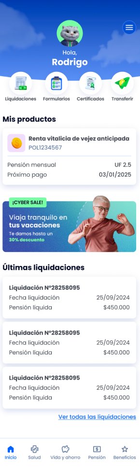
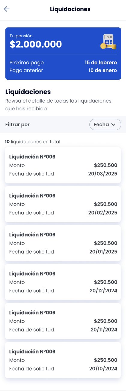
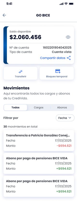
Designed Screens 📱
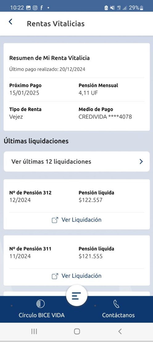
Home, life annuity, settlements, and GO BICE (CrediVida).
Swipe to see more →
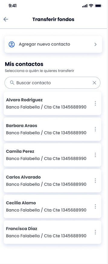
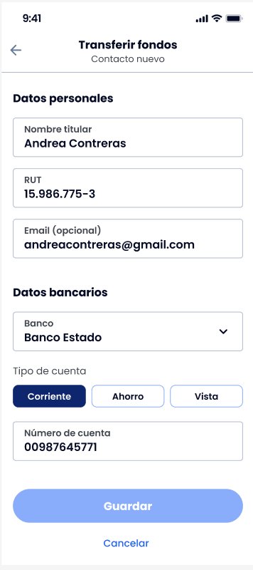
Before vs. After 🔄
Transfers flow: from a complex desktop form to a mobile flow with saved contacts and clear steps.
Usability Study 🔬
9 retirees · 6 flows · ~45 min per session
Settlements are the center of the world
Most participants looked for all information in settlements, even data that didn't belong there.
They want to see all future payments
The next payment alone wasn't enough. They wanted a complete list to plan their expenses.
Problems with the OTP code
One participant reported never receiving the transfer code, blocking the flow.
Font size matters
Multiple participants asked for the option to enlarge text, especially the older ones.
💡 Research Impact
From an app with less than 10% adoption to an experience redesigned from scratch. The testing findings prioritized improvements in settlements, OTP, and accessibility. Research with real users uncovered friction points that internal testing would not have captured.
The Solution ✨
Typography and Contrast
Increased typographic scale and palettes meeting the highest accessible contrast standard (AAA).
Simplified Navigation
Hidden menus and complex gestures replaced with explicit buttons.
Visual Hierarchy
Direct access to critical tasks (My Payments, Certificates) on the home screen.
Inclusive Design
We didn't just change the size — we redesigned the way retirees interact with their finances, giving them back their digital autonomy.
"We turned frustration into autonomy."